


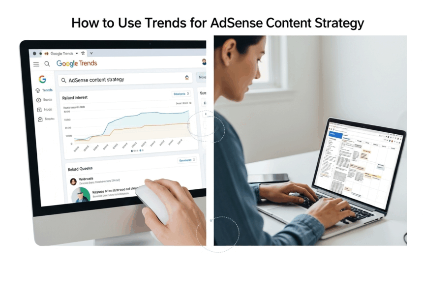
How to Use Google Trends for AdSense Content Strategy
I was staring at my blog’s traffic chart. Again. It was flatter than a pancake on a Tuesday morning. For months, it had been the same story: I’d pour my heart and soul into a post, hit publish with a little surge of hope, and then… crickets.
A tiny spike, maybe. A few pity clicks from my aunt. But nothing sustainable. Nothing real.
It felt like I was a DJ playing music in an empty room. I was passionate, sure. I thought my playlists were great. But nobody was dancing because nobody was even there. The dream of my little website making a few bucks from AdSense felt… well, it felt pretty stupid, if I’m being honest.
I was just guessing. Throwing digital spaghetti at a wall and praying something would stick. But none of it was. I realized that my whole “content strategy,” if you could even call it that, was based on pure vibes. And vibes don’t pay the bills.


That was the night I finally decided to get serious. I knew I had to learn how to use Google Trends for an AdSense content strategy, not because some guru told me to, but because my current method of pure guesswork was actively driving me insane. I was sick of talking to an empty room.
So I brewed a pot of coffee that could probably power a small car, and I dove in. What followed was a week-long spiral into a world of charts, queries, and squiggly lines that almost broke my brain. But what I found on the other side changed everything.
My First Steps Into the Weird World of Google Trends
So, I navigate my way over to the Google Trends website. And my first impression? It’s empty. So much empty white space. Just a search bar and a few examples. It felt less like a powerful tool and more like an abandoned government website from 1998.
More Read


No bells. No whistles. It was… intimidating. So I did what anyone would do. I typed in a word. I think it was “sourdough,” because I was in that phase. We all had that phase, right?
Instantly, a chart popped up. A blue, jagged line bounced across my screen, looking like an earthquake detector during a particularly shaky month. It was just a line. What was I supposed to do with this? There were no instructions, no helpful pop-ups. It was just me, staring at this squiggly line, feeling dumber by the second.
I started to get lost in the jargon almost immediately. Gurus online would talk about it so casually, throwing around terms like seasonal trends and trending topics as if they were as simple as “hello” and “goodbye.” But to me, it was a completely foreign language.
The Squiggly Line of Human Attention
It took me a while, but I eventually started to understand what I was looking at. The best analogy I can come up with is this: Google Trends is like a stock market ticker, but instead of tracking the value of a company, it’s tracking the value of an idea. It’s showing you how much of the world’s attention is being spent on any given topic at any given time.
That blue line wasn’t just a line. It was a visual representation of human curiosity.
When the sourdough line shot up in March 2020, that wasn’t a random fluctuation. That was millions of bored people, all stuck at home, simultaneously thinking, “You know what? I bet I could bake bread.”
Seeing it that way was my first little lightbulb moment. This wasn’t a spreadsheet. This was a direct look into the collective consciousness of the internet. It was weirdly profound. And for my purposes, it meant I could see what people were starting to care about. In theory.
My First Attempt Was, Predictably, a Total Flop
Armed with this newfound, deeply philosophical understanding of a simple line chart, I decided to take it for a spin. I saw that “dalgona coffee” was starting to spike. It was one of those trending topics that seemed to erupt out of nowhere.

“Aha!” I thought. “This is it! I’ll catch the wave!”
So I stayed up half the night, whipping coffee and sugar into a frothy mess in my kitchen. I took approximately 400 photos of it in a cute mug. I wrote a blog post about it. “My Epic Journey to Dalgona Coffee Perfection.”
I hit publish, imagining myself riding this glorious traffic wave all the way to the bank.
And what happened? A trickle. Not even a trickle. A damp spot.
By the time I wrote my post, a thousand other, much bigger websites had already covered it. The trend was already cresting. My little blog post was like showing up to a Super Bowl party a week after the game. All the snacks were gone, and someone had spilled dip on the carpet. It was a total failure. And it taught me my first, and most important, lesson. This tool wasn’t as straightforward as I thought. Not by a long shot.
Turns Out, a Lot of People Are Wrong About This Tool
After my glorious coffee failure, I got a little disillusioned. I went back to my research, but this time with a healthy dose of skepticism. And I started to realize that a lot of the common advice about Google Trends is either misleading or just plain wrong.
It seems like people fall into one of two camps: they either ignore it completely, or they treat it like a magic 8-ball that will solve all their problems. But the truth, as I was slowly discovering, is somewhere in the messy middle.
It’s a powerful tool, for sure. But it’s not a crystal ball. And using it correctly means understanding what it can’t do just as much as what it can. It was time to unlearn some of the “common knowledge” that was leading me astray.
Myth #1: It’s a Magic Content Idea Generator
This was the trap I fell into headfirst. I thought Google Trends would just hand me a list of hot topics to write about. And yes, it has that “Daily Trends” section, which is basically a list of what celebrities are getting divorced and what new movie trailer just dropped.
For a serious content creator, this is almost completely useless.
Why? Because by the time a topic is on that list, you’re already too late. As I learned with my coffee disaster, the news sites, magazines, and mega-blogs have already flooded the zone. Trying to compete with them on a breaking news topic is like trying to out-sprint a cheetah. You are not going to win.
The real power of this tool, from what I can tell, isn’t about chasing what’s popular today. It’s about keyword forecasting and seeing what’s likely to be popular tomorrow. Or next month. Or next year. This great article from Search Engine Journal talks about this, differentiating between a “fad” and a “trend.” It’s about finding the gentle, upward slope, not the spike that’s already happening.
Chasing daily trends is a recipe for burnout and disappointment. You can’t build a sustainable AdSense strategy on topics that will be irrelevant in 48 hours. You’ll spend all your time writing, with almost no long-term reward. It’s a hamster wheel.
Myth #2: This Is Just for Big Companies and News Outlets
I definitely felt this at first. The tool feels so… official. So data-heavy. It seems like something that only a market analyst at Coca-Cola or a data journalist at The New York Times would know how to use properly. It feels like you need a degree in statistics to make any sense of it.
But that’s just not true. It’s all about scale.
A big company might use it to see if “plant-based diets” are a growing trend across the entire country. But me? A lowly blogger? I can use it for something much smaller. I can use it to see if people in my city are more interested in “kayaking” or “paddleboarding” this summer.


It’s the same tool, just used with a different lens. Thinking this way made it much less intimidating. I wasn’t trying to predict the global economy. I was just trying to figure out if I should write about kayak racks or paddleboard leashes. That’s a question I can actually answer.
You just have to ignore all the fancy corporate case studies and think about it on your own terms. It’s for you. It’s for me. It’s for anyone who wants to stop guessing.
Myth #3: The Higher the Number, the Better the Topic

The graph in Google Trends goes from 0 to 100. So, naturally, our monkey brains think 100 is good and everything else is bad. We see a topic with a huge, spiky line that hits 100 and we think, “That’s the one! That’s the golden ticket!”
But the number is all about relative popularity.


That 100 just represents the peak popularity of that specific term during the selected time frame. It doesn’t tell you the actual number of people searching for it. A term could peak at 100 and still have a tiny number of actual searches.
For example, a search for a hyper-niche hobby like “antique fountain pen restoration” might hit a 100 on its little chart. But the actual number of people searching for that might be a few hundred. Meanwhile, a term like “banana bread” might only be at a 20 on the chart, but that could represent millions of searches.
This was a critical realization. The Trend number isn’t a score. It’s a snapshot. You can’t use it in a vacuum. You have to combine what you learn from Trends with a more traditional keyword research tool to understand the actual search volume. Once I understood that, it was like putting on a pair of 3D glasses. The picture suddenly had depth.
The One Simple Idea That Finally Made Google Trends Click
I was on the verge of giving up. I had the sourdough failure, the dalgona coffee flop, and a brain full of contradictory advice. The tool was starting to feel more like a confusing toy than a professional instrument.
I was treating it like a magic machine that was supposed to spit out ideas. I’d type things in, look at the line, and then get frustrated when it didn’t magically write my blog post for me.
The “aha!” moment came when I finally understood what it wasn’t.
It is not a map. A map shows you exactly where to go. It gives you turn-by-turn directions. Google Trends doesn’t do that. It is a compass. A compass doesn’t tell you the path. It just tells you which direction is north. You still have to find your own way through the woods.
I Was Using It Completely Backward
My entire approach was reactive. I was looking for what was already popular. I was looking backward.
The breakthrough came when I started using it to look forward.
The real magic of Google Trends isn’t in finding a topic. It’s in finding the right time to post about a topic you’ve already chosen. It became my timing machine. It let me peek into the future of audience interest.

Let’s say I have a blog about gardening. My old method would be to randomly write about “how to plant tomatoes” in, say, November. It’s a good post. It’s helpful. But nobody is thinking about planting tomatoes in November. I’d publish it, it would get zero traffic, and I’d get discouraged.
My new method? I go to Google Trends. I type in “plant tomatoes” and set the date range to the last five years. And what do I see? A perfectly predictable pattern. An identical spike every single spring, year after year. Like clockwork.
So now, I don’t post about tomatoes in November. I write the post in November, sure. I get it ready. But I schedule it to go live in mid-March, right before the wave starts to build. I’m not chasing the wave anymore. I’m paddling out and waiting for it. I know it’s coming.
This one shift in perspective changed my entire workflow and, honestly, my entire sanity. You can even read about my struggle with this concept in a post I wrote a while back, called [The Content Timing Mistake That Was Killing My Blog].
A Farmer’s Almanac for Ideas
I started thinking of Google Trends as a modern-day Farmer’s Almanac. For centuries, farmers have used almanacs to predict the seasons, to know when to plant and when to harvest. They relied on patterns.
That’s exactly what this tool allowed me to do for my content.
I was no longer just a blogger. I was a content farmer. I was looking for the predictable seasons of public interest. “Christmas cookies” spikes every December. “Gym membership” spikes every January. “Spring cleaning” spikes every… well, you get the idea.
These aren’t fads. These are deeply ingrained cultural and seasonal rhythms. And every single niche, no matter how obscure, has them. Your job, and my job, is to find those rhythms. Once you can see them, you can build your entire content calendar around them. You stop guessing, and you start planning. You start farming instead of just hunting. It’s a calmer, saner, and far more effective way to live.
My Personal, No-Nonsense Guide to Actually Using Google Trends
So, after I pulled myself out of that rabbit hole, what does my actual process look like now? I’ve got to be honest, it’s not some fancy, color-coded spreadsheet system. It’s more of a cobbled-together checklist that I run through to make sure I’m not just falling back into my old guessing-game habits.
This is my personal system. My no-BS approach. It’s what helps me use Google Trends for my AdSense content strategy in a way that actually works. It’s my sanity check.


Step 1: I Go Spelunking for Seasonal Rhythms
Before I even think about a specific post, I do a broad niche market analysis of my entire topic. Let’s say my blog is about home improvement.
I’ll go to Trends and type in broad terms, one by one. Things like “gardening,” “painting,” “deck staining,” “insulation,” “plumbing.” I set the range to “5 years” to get a really clear view of the long-term patterns.
What I’m looking for are those beautiful, predictable, repeating waves.
“Deck staining” always spikes in late spring. “Insulation” always spikes in the fall. “Gardening” has a massive spike every single spring. These are the foundational beats, the seasons of my niche. I map these out first. This gives me a bird’s-eye view of the year ahead. Google itself has a great resource called Think with Google, where they often publish articles about understanding these consumer trends, which is a fantastic place to get your head in the game.
Step 2: I Find the Rising Stars, Not the Superstars
Okay, so I know the seasons. But I also want to find new topics that are growing in popularity over time. Not the flash-in-the-pan fads, but the slow burners. The trends with legs.
This is where the “Compare” feature is my best friend.
Let’s say I’m in the home coffee niche. I might compare four different brewing methods: “pour over coffee,” “french press,” “aeropress,” and “cold brew.”
I set the timeline to 5 years again. I might see that “french press” is stable or slowly declining. I might see that “aeropress” is a small, consistent line. But then I might see that “cold brew,” while still smaller than “pour over,” is on a steady, consistent upward trajectory. It’s been growing, year after year.
That upward slope is gold. That tells me that audience interest is building over the long term. That’s a horse worth betting on. It’s a fantastic way to find those breakout topics before they become totally saturated.
Step 3: I Zoom In and Hunt for Breakout Keywords
Once I’ve identified a bigger trend (like “cold brew”), I then use Trends to find specific, breakout keywords within that topic.
This is where the “Related queries” tables at the bottom of the page are a goldmine. Seriously, people ignore this part, and it’s one of the most powerful features.

There are two little boxes: “Top” and “Rising.” “Top” just shows you the most popular related searches, which is okay. But “Rising”… “Rising” is where the magic is. It shows you the queries that have had the most significant growth in the selected time period. Often, you’ll see queries marked with “Breakout.” This is Google’s way of screaming at you, “HEY! LOOK AT THIS! PEOPLE ARE SUDDENLY SEARCHING FOR THIS LIKE CRAZY!”
So for “cold brew,” I might see a rising query like “nitro cold brew at home” or “best cold brew coffee beans.” These are hyper-specific, long-tail keywords that people are actively starting to search for. They are my next blog posts. Handed to me on a silver platter. Data from sources like the Pew Research Center often show how public interest shifts, confirming that paying attention to these rising queries is key to staying relevant.
Step 4: I Time My Posts Like a Secret Agent
So now I have my topics. I know what’s seasonally popular and what’s on the rise. The final step is to use Trends one last time to pinpoint the exact timing.
I’ll take a seasonal keyword, like “how to build a raised garden bed.” I’ll set the Trends timeline to just the last 12 months. This lets me see the most recent spike in sharp detail.
I’m looking for the exact moment the curve starts its upward climb. Not the peak! The beginning of the climb.
If the climb for that topic started around, say, March 15th last year, then that’s my target. I make sure my post is published, optimized, and ready to go by March 1st this year. This gives Google time to find and index it. Then, just as people start searching, my post is already there, waiting for them. It feels like magic, but it’s just planning. You can read about my entire pre-launch process in [My Ultimate Pre-Publishing Checklist], where I detail this timing strategy.
So, Where Does That Leave Me?
I’m still not a guru. I’m not a data scientist. I’m just a regular person with a blog who got sick of feeling like a failure.
I’m not going to pretend I have it all figured out. I still have posts that flop. I still make mistakes. But the difference now is that I have a compass. My decisions are no longer based on a gut feeling or a random whim. They’re based on data. They’re based on a real, tangible understanding of what people are looking for and when they are looking for it.
The flat line on my traffic chart isn’t so flat anymore. It has bumps now. It has waves. It has rhythm. Because my content now has rhythm.
Learning how to use Google Trends for my AdSense strategy didn’t just teach me about charts and graphs. It taught me to stop thinking about what I wanted to write and start thinking about what my audience needed to read. It forced me to listen.
The tool itself is simple. It’s free. It’s sitting there, waiting for you. The hardest part isn’t learning how to use it. It’s changing your mindset. It’s shifting from being a hopeful guesser to a strategic planner. And that journey, for me, has been worth more than any AdSense check could ever be.
What’s the one question about your audience you’ve always wanted to answer?


